

A one-page website for your association
When you're small, you don't need a ten-page site nobody keeps current. Here's how to put everything a prospective member needs - who you are, what they get, when you meet, a join button - on a single honest page.
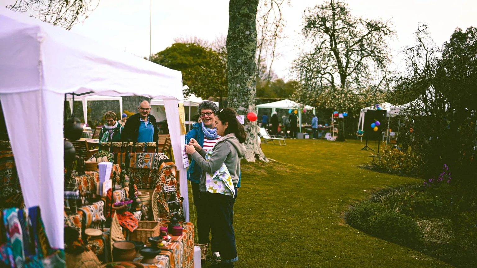
There's a moment, usually a few months into running something, when a member says "we should really have a website", and a small dread sets in - because in most people's heads a website means pages and pages, a menu across the top, an "About" and a "News" and a "Gallery" and a "Contact", all of which need writing and, worse, need keeping up to date forever. So the whole thing gets put off, or a big site gets half-built and then quietly rots, three years out of date, the last event listed sometime in 2023, a "latest news" section whose most recent news is that you once had a news section. For a small community organisation there's a much better answer that almost nobody reaches for first: one page. Just the one. Everything a prospective member needs, top to bottom, on a single scroll, and nothing you'll be embarrassed by in eighteen months.
Let me carry one example the whole way through so this stays concrete. Say you help run Dapur Bangkit, a Bandung community for small food businesses - warung owners, home bakers, catering folks, the sambal-and-frozen-food crowd, a couple of coffee roasters - maybe 40 - 60 members who'd sooner grow together than each struggle away on their own. You meet the first Sunday of the month, you buy packaging and ingredients in bulk together, you run the odd shared stall at a city bazaar, and right now the entire "web presence" is a WhatsApp group and an Instagram that one committee member keeps alive between orders. People keep asking "is there a link I can send my friend who just started selling risoles?", and there isn't one. That gap - a single, sendable link that explains the whole thing - is exactly what a one-page site fills, and for a group like Dapur Bangkit it's very likely all the website you'll ever need. If you're only just getting the group off the ground, the guide on starting a club covers that side; this piece is about giving it a front door once it exists.
Why one page beats a site nobody updates
The honest problem with a big site isn't building it - plenty of tools will throw up ten pages for you in an afternoon, and some of them look quite smart. The problem is that a ten-page site quietly makes ten promises to keep current, and a volunteer-run organisation where everyone already has a business to run will keep roughly none of them. Six months later the events page is stale, the gallery is from a bazaar two years ago, and a prospective member who lands there gets the worst possible first impression: not "these people don't exist", which they'd forgive, but "these people gave up", which they won't. A site that's visibly out of date does you more harm than no site at all, because it whispers that the community itself has gone quiet.
One page sidesteps the whole trap. There's less to write, so it actually gets finished. There's less to maintain, so it actually stays true. And because everything sits on a single scroll, a visitor gets the complete picture in the fifteen or twenty seconds they're willing to give you, without hunting through a menu to work out whether you're for them. You're not building a website so much as writing one good, honest page that answers the questions people are already asking - and that is a job you can finish this week rather than a project that hangs over the committee for months.
What a prospective member is actually trying to find out
Before worrying about sections and layout, it helps to sit in the visitor's chair for a second. Someone who's just started selling frozen dim sum from home, heard about Dapur Bangkit from a friend, and clicked your link is quietly asking five things, roughly in this order:
- What is this, and is it for people like me? A home-kitchen seller wants to know they won't be the odd one out among established cafes - or the other way round.
- What do I actually get out of joining? The bulk buying, the bazaar slots, the sessions on halal certification and BPOM and decent product photos, the group that answers when you're stuck.
- When and where do you meet, and how often? Because "first Sunday of the month in Bandung" tells them in one line whether it fits their life at all.
- How much, and how do I join? The dues, and the single next step to actually become a member.
- Are you real, and are you still active? A recent photo, an Instagram that's alive, a real person's WhatsApp - proof that this isn't a group that fizzled out last year.
Answer those five honestly and you have a website. Everything else people talk about - fancy design, a logo, an animation on the hero image - is trimming, and none of it matters if a visitor can't tell within twenty seconds whether they belong and what to do next. So the whole design job is really just deciding the order those five answers appear in, top to bottom.
The one-pager, section by section
Here's the running order that tends to work, and you can lift it more or less as-is. It maps neatly onto those five questions, which is the point.
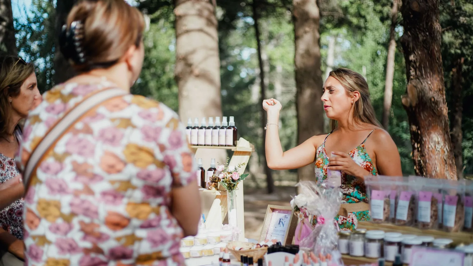
A headline and one plain line saying who you are. At the very top, the name and a single sentence a normal person would say out loud. For Dapur Bangkit: "A Bandung community for small food businesses - warung, home kitchens, catering, kue and frozen food - growing together instead of alone." That one line does an enormous amount of work, because it quietly tells the risoles seller "yes, you", and tells a big franchise "probably not us", which is exactly the sorting you want. Put a real photo behind it or beside it, not a stock shot of someone else's kitchen.
What members get. Three to five concrete things, in plain words, no marketing gloss. For Dapur Bangkit that's the monthly meetup, a slot at the shared bazaar stall, group buying on packaging and ingredients at a better price, practical sessions (halal cert, BPOM registration, product photography, pricing), and a WhatsApp group that actually answers. Be honest here - list what you really do, not what you hope to do one day, because a member who turns up expecting the aspirational version and finds the real one feels cheated, and a member who gets a pleasant surprise stays.
When and where you meet. One line: "First Sunday of every month, rotating between member cafes around Bandung." If it's online, say so. This is the single most-skipped detail on community websites and it's the one people most want, because it answers "can I even do this?" before they invest any hope in it.
The join step. One clear button or link that says exactly what happens when you press it, plus the price in plain numbers. More on this below, because it's the bit most groups get slightly wrong.
Proof you're real, and how to reach a human. A recent photo or two, the Instagram handle, and a WhatsApp number or contact form so a hesitant person can just ask a question first. That's the whole page. If you're staring at it thinking it looks a bit short - good. Short is a feature. Short means somebody read all of it.
Make the join button do the work
This is where a surprising number of one-pagers fall down. They explain everything beautifully and then end with "contact us for more information", which quietly asks the reader to do the work of figuring out the next move, and a good number of them simply won't bother. Tell them the next step in so many words. For Dapur Bangkit the dues might be something like Rp 25.000 - 50.000 a month, or a flat Rp 200.000 - 300.000 for the year, and the join step could be as simple as a "Join Dapur Bangkit" button that opens a short form or drops them into a WhatsApp chat with whoever handles new members. Whatever it is, name it: "Fill this in and we'll add you to the group before the next meetup" beats "get in touch" every time.
The button doesn't have to be clever, it has to be obvious and honest. Don't hide the price - a food seller watching every rupiah will trust you more for putting "Rp 200 ribu setahun" right there than for making them ask. And don't build an elaborate payment and sign-up flow on day one if a form plus a QRIS transfer will do; you can always tidy the plumbing later. What matters now is that the path from "this looks good" to "I'm in" is a single, plainly-labelled press, not a scavenger hunt.
A quick test worth running: show your draft page to someone who's never heard of the group - a cousin, a neighbour - and time how long before they can tell you, in their own words, what it is, what you'd get, when you meet, and how they'd join. If they can do it inside about thirty seconds, the page works. If they're scrolling back up looking for something, that's the bit to fix, and you found it for the price of one coffee.
Keeping it honest is the whole advantage
The quiet superpower of a one-page site is that it's small enough to keep true. When there's only one page, updating it is a five-minute job someone will actually do - change the next meetup date, swap last month's bazaar photo in, nudge the dues if costs have crept up. Compare that with a ten-page site, where "update the website" is a vague, dreaded chore nobody owns, so it never happens. Pick one person to give the page a two-minute glance each month, ideally right after the meetup while it's fresh, and it'll stay accurate for years. That reliability is worth far more than any design flourish, because a page that's plainly current tells a visitor the community is alive in a way no amount of styling can fake.
It's worth being a little careful about what you put on the page for exactly this reason. Anything that dates fast - a full events calendar, a running blog, member counts to the exact number - is a maintenance promise you may not keep, so either commit to keeping it current or leave it off. "We meet the first Sunday of the month" never goes stale; "Next event: 14 March 2024" goes stale the moment that date passes and then actively works against you. Prefer the evergreen version of everything, and you'll have a page that looks after itself.
When to add a second page (and when not to)

One page carries a small community a very long way, and plenty never need more than that. But there are a few honest signals that you've genuinely outgrown it, and they're worth knowing so you neither jump early nor cling on too long. The usual one is that a section on the page wants to become a thing in its own right - the "what members get" list has grown into a proper programme of sessions with dates and sign-ups, or members are asking for a private area to swap supplier contacts and recipes away from public view, or you've built up enough of a member directory that showing off everyone's food businesses would actually pull in customers and new members. When a single section is straining to be its own page, that's the moment to give it one, and not really before.
What I'd gently steer you away from is adding pages because a website "should" have them. You do not need an "About" page separate from the one line at the top, a blog you'll post to twice and abandon, or a five-item top menu for a two-scroll site. Add a page when there's a specific, live need pulling for it - a members-only area, a real events schedule, a directory that earns its keep - and not a moment sooner. When that day comes and you're weighing up a proper members' area, logins, an events calendar and the rest, the fuller guide to building a membership website walks through the whole thing; you'll know you're ready because a genuine need will be pushing you there, rather than a feeling that a bigger site would look more legitimate. It won't - a current one-pager looks more legitimate than a sprawling site gone stale, every time.
What you can safely skip
To close the loop on the anti-overbuilding theme: for a group like Dapur Bangkit you can happily skip a custom logo, a photo gallery, a full events calendar, a blog, an "our story" essay, a top navigation menu, and anything described as a "member portal" - not forever necessarily, but certainly to start, and possibly for years. None of those things is what makes a prospective member decide you're worth their Sunday. What makes them decide is a clear line about who you are, an honest list of what they'd get, a meeting time that fits their life, a price they can see, one press to join, and proof you're real and still going. Get those right on a single page and you've got a website that does its job, that you'll keep up to date because keeping it up to date is easy, and that you can build on later only if and when the community actually asks for it….
Setting the page up is the easy half; the bit that quietly eats organisers' evenings is what happens after someone presses join - collecting the dues, remembering who's paid, keeping the member list straight, getting the welcome out. That's the part Anggota is built to take off your hands, and it's free to start, so the join button on your one-pager can lead somewhere that does the remembering for you. But the page itself you can build on anything, and the ideas here hold whatever you use to put it online - a single honest page that answers the five questions will serve a small community better than a ten-page site nobody keeps current, however you choose to make it. Above all, good luck with it - somebody out there just started selling something from their kitchen and could use a group exactly like yours, and now they'll have a link to find you.