

EN, Language: English
Language
EN, Language: English
Help centre
Guides and answers for running your organisation on Anggota.
Colours, fonts and header
The look of your public website (colours, fonts, your logo and how the header is arranged) is set on the Design tab of the Website screen, which is split into tabs of its own: Branding, Colour scheme, Header layout, Fonts and Top menu. Each tab holds one decision, so you are never scrolling past settings you did not come for.
Colour scheme
Open the Colour scheme tab and click Open Designer. The designer shows a live mock-up of your site beside the controls, so every choice is visible before you save.
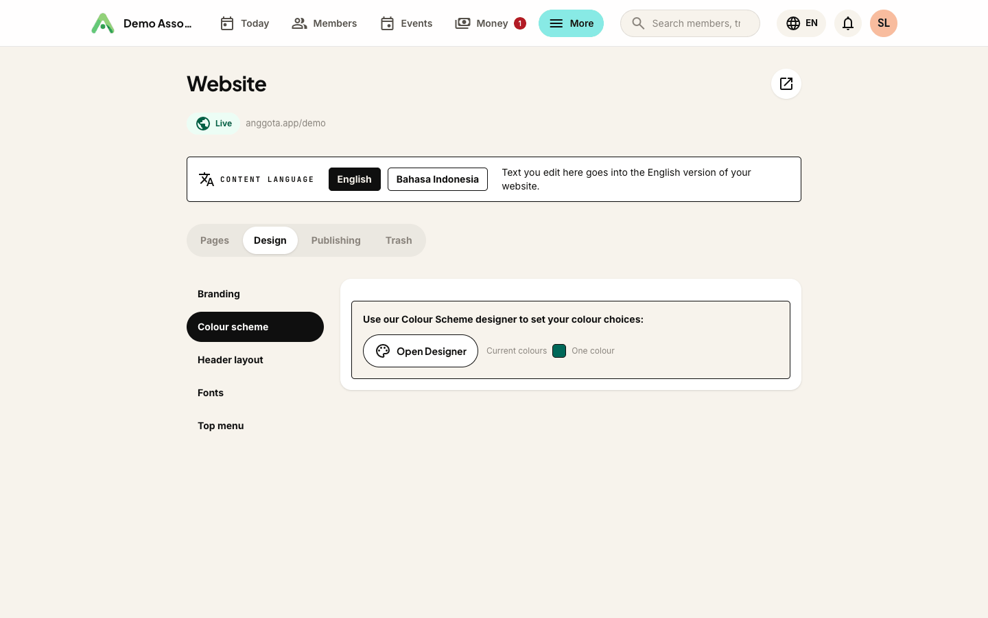
You set one or two brand colours. One colour is a perfectly good answer, so leave it at that for a single-colour look, or add a second colour when your brand has one.
Buttons and links then choose from your palette, not from a free colour picker. Under Buttons & links you decide what Buttons use and what Links use:
- Primary - your main brand colour.
- Second colour - your other brand colour, if you set one.
- Neutral - flips automatically: near-black on a light area, white on a dark one.
Because the choices come from your palette rather than an open picker, whatever you pick stays readable against whatever it sits on, and you cannot accidentally put a pale yellow button on a white page.
Header and footer can differ from the page
Your site has three regions (Page, Header and Footer), and the header and footer do not have to match the page. Each can be:
- Match page - the default; it follows whatever the page does.
- Light or Dark - a neutral surface, lighter or darker than the page.
- Primary or Second colour - paints the whole band in that brand colour.
A dark header over a light page is the usual reason to reach for this, but a brand-coloured band across the top is the one people notice.
Page background
Page background is a real control now. Leave it blank and it takes a soft tint from your primary colour. Set it to something specific and that wins, and if you choose a deep colour, the text on it switches to light automatically, so a dark background never leaves you with unreadable copy.
Header layout
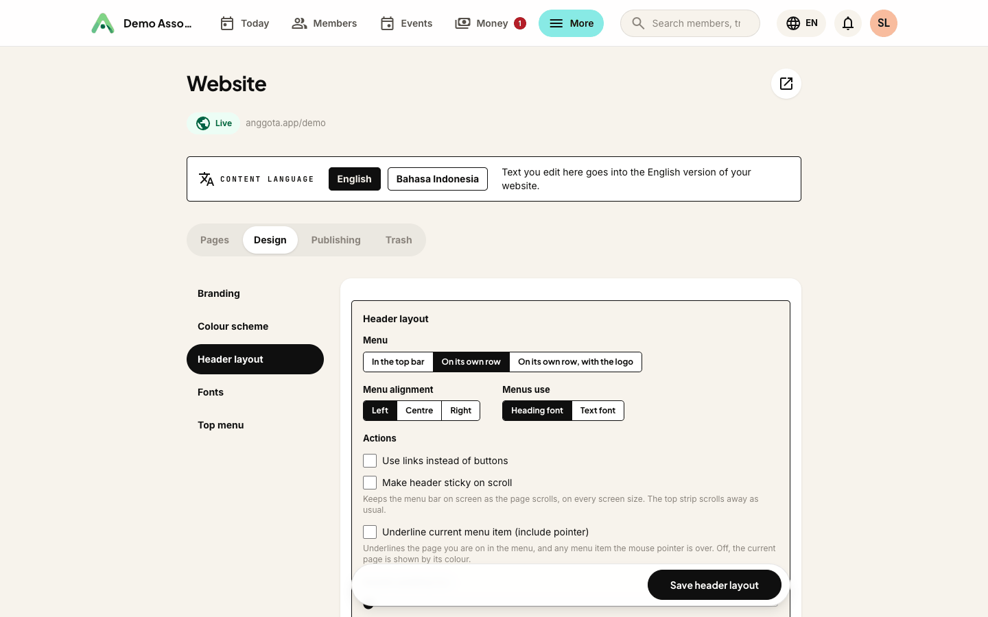
The Header layout tab decides where things sit, not what colour they are. The choices:
Menu - where the navigation goes:
- In the top bar - alongside the logo, the compact arrangement.
- On its own row - a full-width menu row beneath the logo, which suits a site with several pages.
- On its own row, with the logo - the logo drops down onto the menu row with it.
Menu alignment - Left, Centre or Right.
Menus use - the Heading font (the default) or the Text font for the menu links. You pick those two fonts on the Fonts tab.
Actions - your Join, Donate, Shop and Member area buttons can be shown as plain links instead of buttons, which calms a busy header down.
Make header sticky on scroll - keeps the menu bar on screen as the page scrolls, on every screen size. The top strip above it scrolls away as usual.
Header padding - a slider for the space above and below the top strip and the menu row, from 5px (tight) to 20px (airy). The preview updates as you drag.
Main menu font size - a slider for the size of the menu links in the header, from 14px (the standard size) to 20px, in 1px steps. Drop-down and phone menus stay at 14px. At larger sizes fewer links fit in the header row (down to five), and the rest move into the menu button.
Branding - your logo
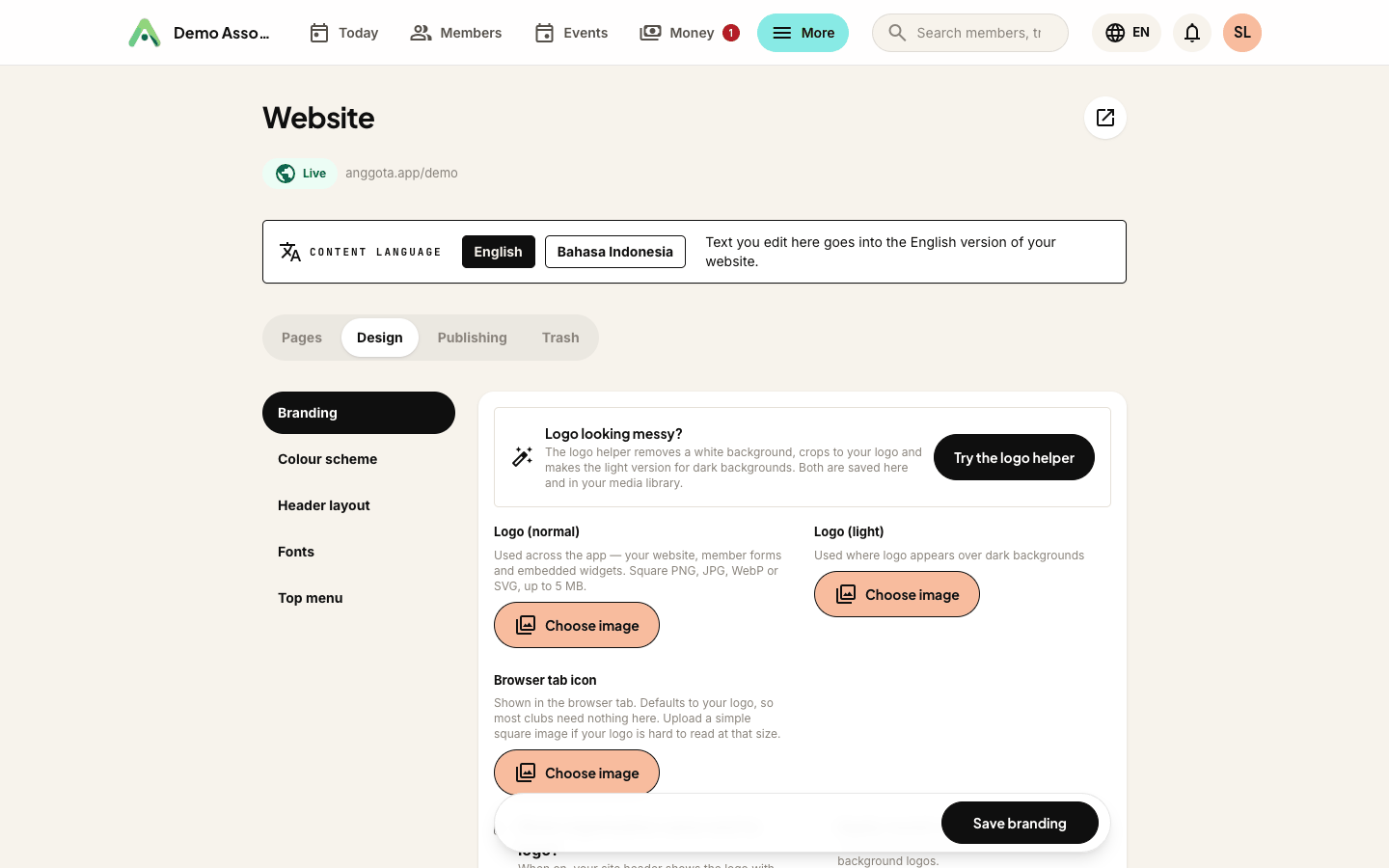
The Branding tab holds your logo. It is set once, in More → Settings → General, and used everywhere (your website, member forms, embedded widgets and emails) rather than uploaded again per surface. Here you decide two things about how it appears on the site: whether the organisation name shows beside it or the logo stands alone, and whether it gets round corners, which tidies up a logo that comes on a solid background.
Logo (light) is an optional second version of your logo in white or reversed colours, for spots with a dark background. Under Logo placement, choose Normal or Light for the Top logo, the Top sticky logo (the header once the page scrolls, shown only when Make header sticky on scroll is on in Header layout) and the Footer logo. The two top choices apply on pages with a hero photo behind the header; pages without one follow the header colour: the light logo on a dark header, the normal logo on a light one. All three start on Normal, and Light uses your normal logo until you upload a light one.
Tick Apply custom logo width to set the logo's width in the header and footer between 60px and 400px in 20px steps. On phones it is capped to fit the screen.
Fonts
The Fonts tab has a Heading font and a Text font, and both search the whole Google Fonts library rather than a shortlist. Type a name, pick it, and it applies to your public site and your embedded widgets, so a page on your own website matches the rest. Leave it on the default if you would rather not choose.
Tip: each tab saves on its own (Save colours in the designer, Save fonts, Save header layout and so on), so save before you switch tabs.
Next: sections and layouts, or add a news section to keep your members up to date.
Still stuck? Reach your Anggota contact and we will walk you through it.
mailContact us