

EN, Language: English
Language
EN, Language: English
Help centre
Guides and answers for running your organisation on Anggota.
Sections and layouts
Your Anggota website is built from sections, which are stacked blocks of content you add, arrange and style without touching any code. This page covers the section toolkit; for the site as a whole, see your Anggota website.
Add a section
- Open More → Pages (the Website screen) and stay on the Pages tab.
- Click the pencil beside the page you want to add to (Home page or any page you have created).
- Under Content sections, click Add.
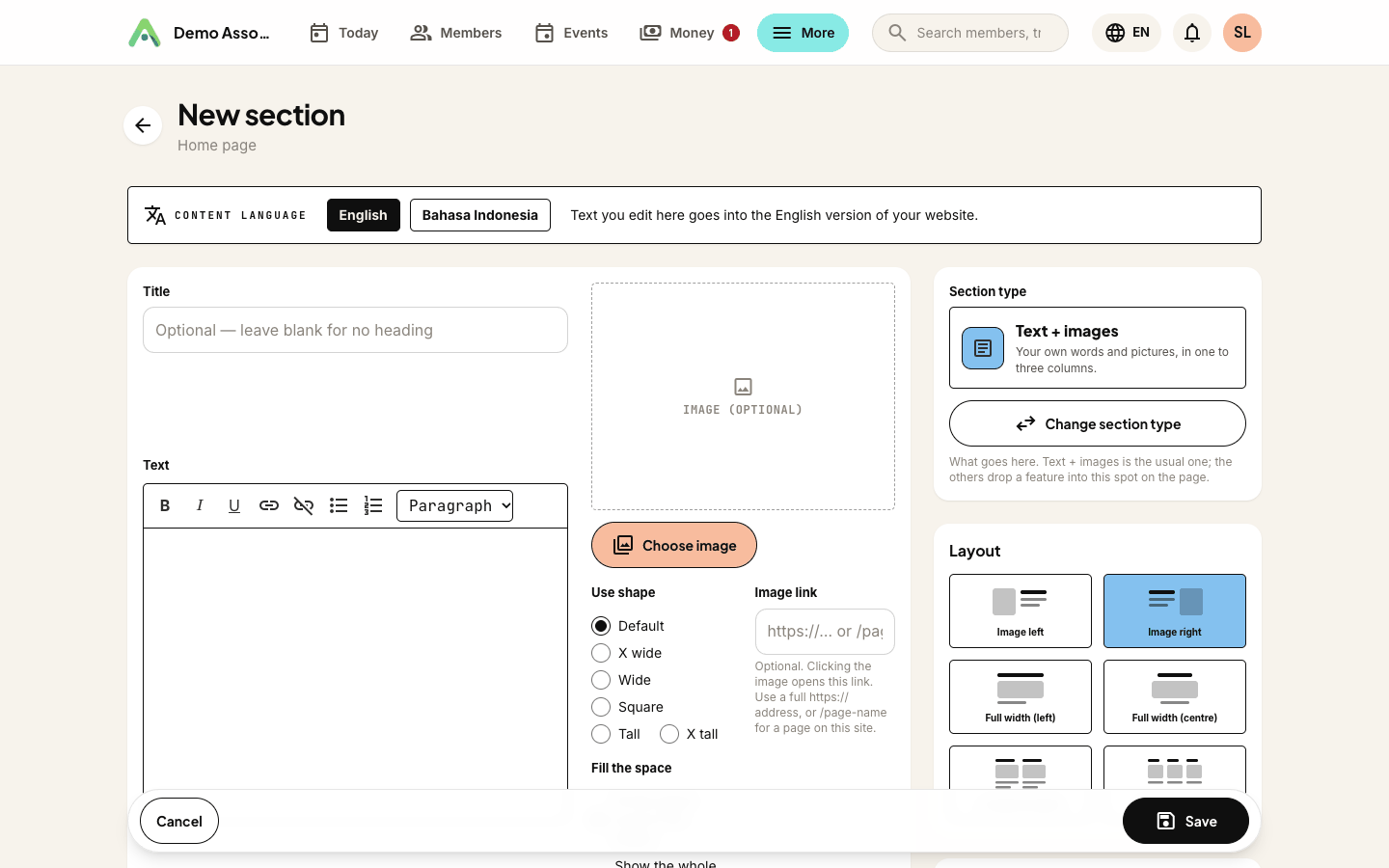
- Give the section a title, write the body in the editor, add an image if you like, and choose a layout. A button is optional: give it a label and a link (a full address, or a page on your site such as
/contact). - Save. The section appears on the page in the order the Content sections list shows.
Each section has its own editing page, so a long piece of content gets the whole screen rather than a cramped pop-up.
Choose a layout
| Layout | What it looks like |
|---|---|
| Image left | Picture on the left, text beside it |
| Image right | The mirror image - text first, picture to the right |
| Full width (left) | One wide column, text ranged left. Good for longer reading |
| Full width (centre) | One wide column, centred. Good for a short statement or a call to action |
| 2 column content | Two side-by-side blocks |
| 3 column content | Three side-by-side blocks |
Two- and three-column sections
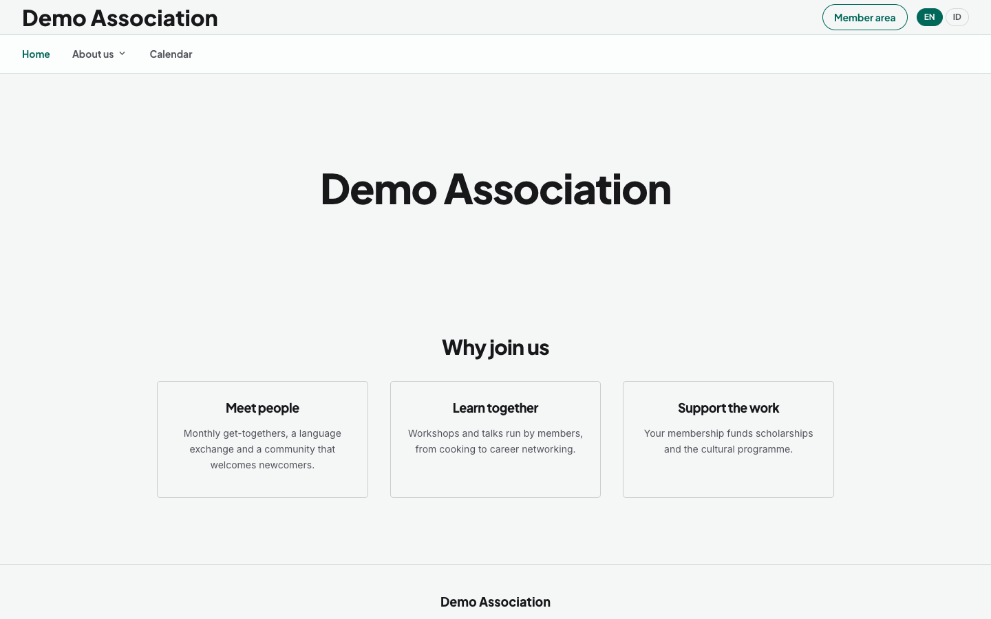
Column layouts are for things that come in sets, such as three membership benefits, two ways to get involved or your committee's focus areas. Each column carries its own title, description, image, and an optional button with its own label and link.
A few extra choices shape the block:
- Align heading - Left or Centre for the section heading above the columns.
- Align content - Left or Centre for the text, images and buttons inside every column. Set both the same and the block reads as one decision, or put a left heading over centred columns.
- Style as cards? - draws a light border around each column with padding inside.
- Corners - Rounded or Square, applied to every column at once.
- Background - leave the columns white, or choose the dark theme, which fills each column with your brand colour and switches the text to white.
On a phone the columns stack one above the other, so the section stays readable on any screen.
Shaping a section's image
Any section with a picture gets two controls beneath it:
- Use shape - Default, X wide, Wide, Square, Tall or X tall. The image is cropped to that proportion, so a row of sections lines up even when the photos you uploaded do not.
- Rounded corners? - softens the image to match the rest of your styling.
Where no image has been chosen yet, the editor shows a placeholder box in the right shape, so you can see how the section will sit before you upload anything.
Feature sections
A section is text and images unless you say otherwise. Under Section type, Change section type (pick one, then Use …) swaps its content for a live feature, placed exactly where the section sits:
| Type | What it shows |
|---|---|
| Text + images | The ordinary section - everything else on this page |
| Events list | Your upcoming public events. Which events shows them all, or only one event type |
| Events calendar | Your events a month at a time, with a colour per event type and a subscribe link - see events calendar |
| Featured event | One event, promoted on its own - see below |
| Contact form | The enquiry form, delivered to your inbox |
| Membership plans | Your public membership levels with join buttons |
| Poll | A public poll your visitors can vote in |
| Photo gallery / Gallery section | Your whole gallery, or one section of it |
| Club vehicles | The member vehicle directory (when the feature is on) |
| Ride leaderboard | This season's top riders (only offered while Club Rides is on) |
| Directory | One of your directories - cover-photo grid, category filter and search. Pick which one under Directory |
| Online courses | Your published courses, ready for visitors to enrol in |
| News (all articles, with categories) | Your whole news archive, with the category list beside it |
| News (one category) | The articles from one news category, without the category list |
| News carousel (latest articles, arrows) | Your latest articles, or one category's, in a row visitors move through with arrows |
| Donations | Your donation prompt with every suggested amount |
| Donation (one amount) | A single suggested amount on its own, as a "give this" call to action |
| Video | A YouTube or Vimeo video, playing in the page. Paste the link and Anggota does the rest |
| Embed code | Anything else with an embed snippet (a map, a booking widget, a social feed), dropped in as its own block |
The News types only appear while News is switched on, and the Donation types only while Donations is on.
A few types have settings of their own:
- Events list - use Which events to build, say, a "Rides" section and a "Social" section from one events calendar. Leave it on All events to show everything.
- Featured event - choose one upcoming public event under Event. Pick a repeating event (marked repeating (always shows the next date)) and the section always shows its next date. A one-off event drops off the page by itself once it has finished. A ride shows its pace groups, each with its own Join button.
- Ride leaderboard - How many riders: Top 10, Top 20 or Top 50. Riders are ranked by kilometres this season, counted from ride sign-on. Only current members appear, shown as first name and initial.
- News types - Article columns (2 columns or 3 columns on wide screens) and Corners (Square or Rounded cards). News (one category) and the carousel also ask which category to show.
- Donations and Donation (one amount) - Alignment: Left or Centre. Donation (one amount) also asks Which amount.
A feature section keeps its title (a heading above a list of events or the directory is genuinely useful), but the body editor and image picker disappear, because the feature brings its own content.
Section titles are optional everywhere. Leave one blank when the content speaks for itself and the section renders without a heading, rather than with an empty gap where one used to be.
Choose which page it appears on
Sections you add from a page's editing screen land on that page, and each page lists only its own sections under Content sections. Once you have extra pages, a section also gets a Show on page field. Change it from Home page to another page to move the section there.
Duplicate a section
Next to each section's edit pencil is a duplicate icon. It makes a full copy (layout, text, image, buttons and all), named "… (copy)" and placed directly below the original. Building three similar columns blocks, or a second page that echoes the first, becomes a matter of copy-then-edit.
Reorder, hide, remove
Use the up and down arrows beside each section to put them in the order you want. Every section has a Visible? switch: turn it off to keep a section in place but off the public page, which is handy for content you are drafting, or a seasonal block you will bring back. Deleting a section leaves its image in your media library.
You can have up to twenty sections on each page. At the limit the Add button greys out. Delete a section to make room, or move the content to another page.
Tip: images you upload are kept in a shared media library, so the same photo can appear in several sections without uploading it twice.
Next: give your site more pages.
Still stuck? Reach your Anggota contact and we will walk you through it.
mailContact us